A user interface design framework is a set of tools and libraries that provide the building blocks for designing and developing user interfaces. These frameworks streamline the design process, ensuring consistency and efficiency across different platforms and devices. By leveraging a robust UI design framework, designers can focus on creating intuitive and visually appealing interfaces without reinventing the wheel.
Why a Good UI Design Framework Matters
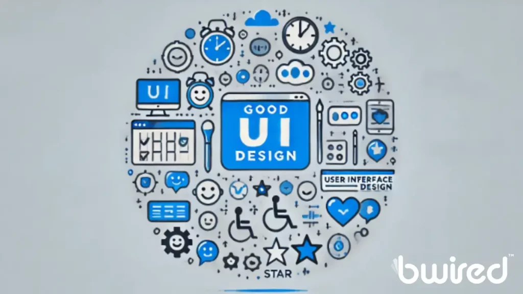
Good UI is like walking into a beautifully designed store where everything is neatly organized, and you can easily find what you need. That’s what a good UI design framework does for your application. It ensures that users can navigate your app effortlessly, leading to higher user satisfaction and retention rates. Here are a few reasons why a solid UI design framework is essential:
- Consistency: Frameworks provide a consistent look and feel across different parts of your application, which is crucial for maintaining a professional and cohesive brand image.
- Efficiency: Using pre-built components saves time and effort, allowing designers and developers to focus on more critical tasks.
- Responsiveness: Many UI frameworks are designed to be responsive, meaning they automatically adjust to different screen sizes and orientations, providing a seamless experience on both mobile and desktop devices.
- Accessibility: A well-designed framework ensures that your application is accessible to all users, including those with disabilities, by adhering to best practices and guidelines.
Popular User Interface Design Frameworks
When it comes to designing user interfaces, several frameworks can help you build professional, responsive, and visually appealing applications. Each framework has its own set of features and benefits, making it suitable for different types of projects. Let’s explore some of the most popular UI design frameworks and understand what makes them stand out:
- Bootstrap:
- Flexibility and Range of Components: Bootstrap is one of the most widely used UI frameworks. It’s loved by web developers for its flexibility and the vast array of components it offers.
- Grid System: At its core, Bootstrap includes a powerful grid system that allows you to create complex layouts with ease. The grid is responsive, meaning it adjusts to different screen sizes automatically.
- Typography and Forms: Bootstrap comes with pre-styled typography and forms, so your text and input elements look polished right out of the box.
- Buttons and Navigation: You get a variety of button styles and navigation components, making it easy to create interactive elements like dropdowns, navbars, and tabs.
- Consistency: Using Bootstrap ensures that your UI elements are consistent across different parts of your application, giving it a cohesive look and feel.
- Material-UI:
- Based on Material Design: Material-UI follows Google’s Material Design principles, which emphasize clean, modern aesthetics with intuitive motion and interaction.
- React Component Library: This framework is specifically designed for React, a popular JavaScript library for building user interfaces. If you’re using React, Material-UI can help you create sleek and modern web applications.
- Customizable Components: Material-UI offers a rich set of components that you can easily customize to match your design requirements. From buttons to dialog boxes, every element is designed to be flexible and adaptable.
- Professional Look: The design guidelines of Material-UI ensure that your application looks professional and user-friendly, enhancing the overall user experience.
- Ant Design:
- Enterprise-Level Features: Ant Design is another React-based framework, known for its comprehensive suite of components and tools. It’s designed with enterprise applications in mind, providing robust features for complex projects.
- Design Language: Ant Design comes with a clear and consistent design language, making it easy to create elegant and efficient interfaces.
- Rich Components: The framework offers a wide range of components, from simple buttons to complex data tables, helping you build feature-rich applications.
- Customization and Flexibility: Ant Design allows you to customize components extensively, so you can tailor them to fit your specific needs and preferences.
- Foundation:
- Responsive Front-End Framework: Developed by ZURB, Foundation is a responsive front-end framework that emphasizes a mobile-first approach. This means it’s designed to work seamlessly on mobile devices and then scale up to larger screens.
- Flexible Grid System: Foundation’s grid system is highly flexible, allowing you to create responsive layouts that adapt to different screen sizes effortlessly.
- UI Components: The framework includes a variety of UI components, such as buttons, forms, and navigation elements, which are all designed to be accessible and easy to use.
- Accessibility: Foundation places a strong emphasis on accessibility, ensuring that your application can be used by people with disabilities. This includes features like keyboard navigation and screen reader support.
- Semantic UI:
- Human-Friendly HTML: Semantic UI uses human-friendly HTML, making it easier to read and understand the code. This can be especially helpful for beginners or teams working collaboratively.
- Responsive Design Capabilities: The framework is designed to be responsive, ensuring that your application looks good on all devices, from smartphones to desktops.
- Integration with JavaScript Frameworks: Semantic UI integrates well with popular JavaScript frameworks, enhancing its functionality and flexibility.
- Intuitive Interfaces: The design philosophy behind Semantic UI is to create beautiful and intuitive interfaces with minimal effort. Its components are straightforward to use and customize, making the development process smoother and faster.

By understanding the strengths and unique features of each UI design framework, you can choose the one that best fits your project’s needs. Whether you’re building a simple website or a complex enterprise application, these frameworks provide the tools and components necessary to create professional and user-friendly interfaces.
Key Components of a UI Design Framework
To truly master a user interface design framework, it’s essential to understand its key components. These typically include:
- Grid System: A flexible and responsive grid system is the backbone of any UI framework. It helps in organizing content and ensuring a consistent layout across different screen sizes.
- Typography: Typography settings, including fonts, sizes, and spacing, are crucial for readability and visual hierarchy.
- Forms: Form elements such as input fields, checkboxes, and radio buttons are essential for user interaction. A good framework provides styled and accessible form components.
- Navigation: Navigation components like menus, breadcrumbs, and tabs help users move through your application seamlessly.
- Buttons: Buttons are a fundamental element of any UI. A robust framework offers various button styles and states (e.g., hover, active) to enhance user interaction.
- Icons: Icons add visual cues and enhance the user experience. Many frameworks come with a built-in icon library.
- Modals and Alerts: Modals, alerts, and other feedback components are essential for user notifications and interactions.
Ensuring Accessibility
Accessibility is a crucial aspect of UI design that ensures your application can be used by everyone, including people with disabilities. Here are some best practices for ensuring accessibility:
- Semantic HTML: Use semantic HTML elements (like <nav>, <header>, <main>, and <footer>) to provide a clear structure to your content. This helps screen readers understand the layout of your page.
- ARIA Landmarks: Use ARIA (Accessible Rich Internet Applications) landmarks to enhance the accessibility of your application. These attributes provide additional context to assistive technologies.
- Contrast and Color: Ensure sufficient color contrast between text and background elements. This makes content more readable for users with visual impairments.
- Keyboard Navigation: Make sure that all interactive elements can be accessed and operated using a keyboard. This is essential for users who cannot use a mouse.
User Testing and Feedback
One of the most effective ways to improve your UI design is through user testing and feedback. By actively involving users in the design process, you can ensure that your interface meets their needs and expectations. Here’s how to incorporate this into your design process:
- Usability Testing: Conduct usability testing sessions where real users interact with your application. This involves observing users as they complete specific tasks within your app. The goal is to identify any usability issues or pain points that users may encounter. Usability testing can be conducted in several ways:
- Moderated Testing: This involves a facilitator who guides the user through tasks and observes their behavior in real-time. The facilitator can ask questions and probe deeper into any issues the user encounters.
- Unmoderated Testing: Users complete tasks on their own, without a facilitator present. This type of testing can be conducted remotely and is often more scalable. Tools like UserTesting or Maze can help facilitate unmoderated testing sessions.
- Contextual Inquiry: This method involves observing users in their natural environment as they use your application. This can provide valuable insights into how your app fits into their daily workflow and highlight any contextual challenges.
- Surveys and Feedback Forms: Use surveys and feedback forms to collect user opinions. Surveys can be distributed at various stages of the user journey, such as after completing a task or upon exiting the application. Here are some tips for creating effective surveys:
- Keep It Short: Ensure your surveys are concise and to the point. Long surveys can lead to survey fatigue, resulting in incomplete responses.
- Ask Open-Ended Questions: Open-ended questions allow users to provide detailed feedback and express their thoughts in their own words. This can uncover insights that closed-ended questions might miss.
- Use Rating Scales: Rating scales (e.g., 1 to 5 stars) can help quantify user satisfaction and identify areas that need improvement.
- Follow Up: If a user provides particularly insightful feedback, consider following up with them for a more in-depth discussion.
- A/B Testing: Implement A/B testing to compare different versions of your UI. A/B testing, also known as split testing, involves creating two or more variants of a UI element (e.g., a button, layout, or color scheme) and testing them with different user groups. This helps you determine which design elements perform better and make data-driven decisions. Here’s how to conduct effective A/B testing:
- Define Your Goal: Clearly define the goal of your A/B test. This could be improving conversion rates, increasing user engagement, or enhancing user satisfaction.
- Create Variants: Develop multiple versions of the UI element you want to test. Ensure that each variant differs in only one aspect to isolate the effect of that change.
- Randomize and Assign: Randomly assign users to each variant to ensure that the results are statistically valid and not biased by user characteristics.
- Analyze Results: Collect and analyze data from the test to determine which variant performs better. Use tools like Google Optimize, Optimizely, or VWO to facilitate the A/B testing process and provide detailed analytics.
Case Studies and Examples
Learning from real-world examples and case studies can provide valuable insights and inspiration for your own projects. By examining how successful companies implement their user interface design frameworks, you can gain a deeper understanding of best practices and innovative approaches. Let’s look at a few notable examples of successful UI design frameworks in action:
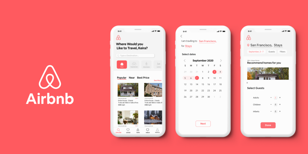
- Airbnb: Airbnb’s user interface is a great example of a well-designed and intuitive application. They use a custom UI framework that ensures a consistent look and feel across their platform. This consistency is key to their user experience, as it allows users to navigate seamlessly from searching for accommodations to booking a stay. Airbnb’s design focuses heavily on usability, with clear calls to action, straightforward navigation, and visually appealing elements that guide users through the booking process. Their use of high-quality images and a clean layout enhances the overall user experience, making it easy for users to find and book their ideal accommodations.
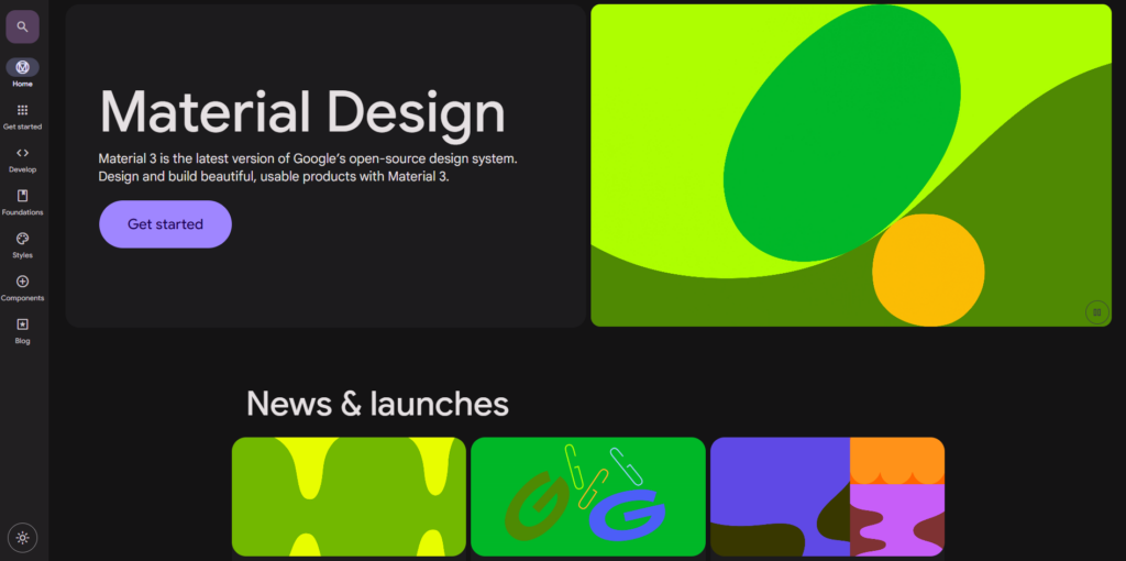
- Google’s Material Design: Google’s Material Design framework is widely used for its clean and modern aesthetics. Introduced in 2014, Material Design is a comprehensive design system that provides guidelines for visual, motion, and interaction design across platforms and devices. It emphasizes the use of grid-based layouts, responsive animations, and transitions, as well as depth effects such as lighting and shadows. Google’s own suite of applications, including Gmail, Google Drive, and Google Maps, showcases the versatility and consistency of Material Design. By adhering to these guidelines, designers can create user interfaces that are both functional and visually pleasing, ensuring a coherent user experience across different devices.
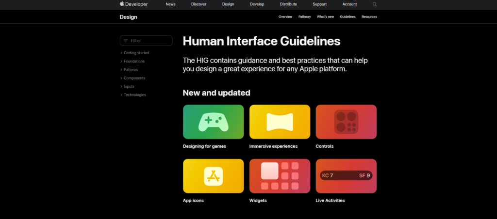
- Apple’s Human Interface Guidelines: Apple’s guidelines provide detailed instructions for creating applications that look and feel native to iOS. These guidelines cover a wide range of design principles, including aesthetic integrity, consistency, direct manipulation, feedback, and user control. Apple’s approach to UI design is centered around simplicity and elegance, ensuring that apps are intuitive and easy to use. The Human Interface Guidelines (HIG) offer comprehensive advice on everything from typography and color palettes to layout and navigation. By following these guidelines, developers can create apps that not only look great but also offer a seamless and enjoyable user experience. Apple’s own apps, such as Safari, Mail, and Photos, are prime examples of the HIG in action, demonstrating how attention to detail and a user-centric approach can result in highly polished and effective user interfaces.
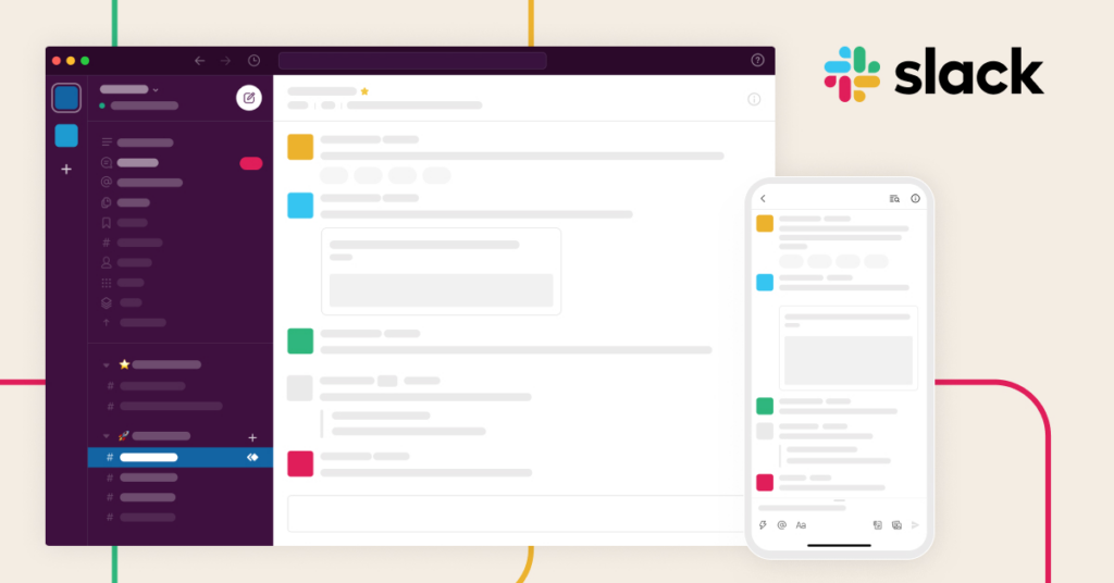
- Slack: Slack’s UI design framework is a testament to how thoughtful design can enhance productivity and collaboration. Slack’s interface is clean, with a well-organized layout that makes it easy for users to navigate between different channels, direct messages, and integrations. The use of color coding and intuitive icons helps users quickly identify different types of notifications and messages. Slack’s design also incorporates subtle animations and transitions that add to the overall user experience without being distracting. Their commitment to accessibility ensures that the platform is usable by everyone, including those with disabilities.
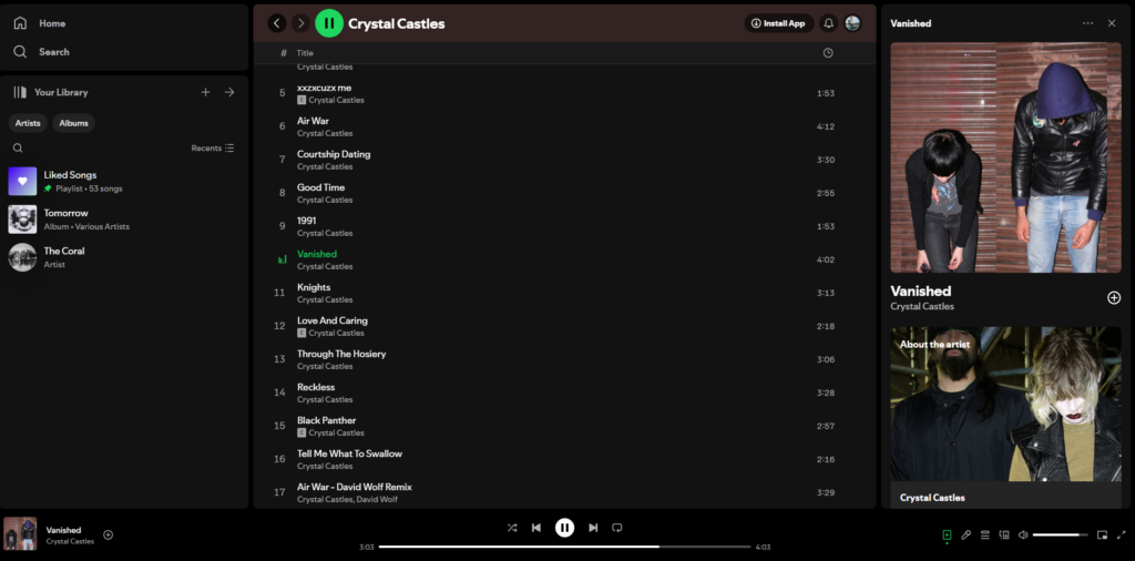
- Spotify: Spotify’s user interface design framework focuses on delivering a seamless and engaging experience for music lovers. The app’s design is centered around ease of use, with a simple and intuitive navigation system that allows users to browse, search, and play music effortlessly. Spotify uses a combination of typography, color, and imagery to create a visually appealing interface. Their use of personalized playlists and recommendations showcases how UI design can be used to enhance user engagement and satisfaction. Spotify’s design also adapts well to different devices, ensuring a consistent experience whether users are on their desktop, tablet, or mobile phone.
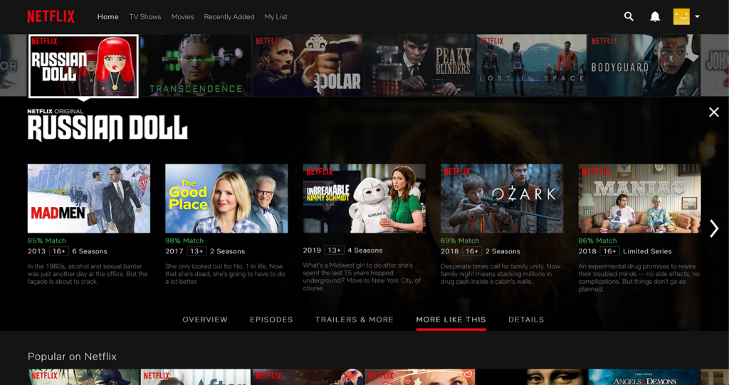
- Netflix: Netflix’s UI design framework is designed to provide a smooth and enjoyable viewing experience. The app’s interface is clean and straightforward, making it easy for users to find and watch their favorite shows and movies. Netflix uses personalized recommendations and visually appealing thumbnails to engage users and encourage them to explore new content. The design incorporates responsive elements that adapt to different screen sizes, ensuring a consistent experience across all devices. Netflix’s attention to detail and focus on user experience is evident in every aspect of their UI design.
By examining these successful examples, you can see how a well-implemented UI design framework can significantly enhance the user experience. Each of these companies has developed a unique approach to UI design that reflects their brand identity and meets the needs of their users. Whether you’re looking to create a clean and modern design like Google, a user-centric and elegant interface like Apple, or an engaging and intuitive experience like Airbnb, studying these case studies can provide valuable insights and inspiration for your own projects.
Conclusion
At Bwired IT Services, we understand the importance of a well-optimized and user-friendly application. As a leading web design agency and IT service provider, we offer comprehensive development services tailored to meet the unique needs of our clients. Whether you’re looking to build a new website, optimize your existing application, or implement cutting-edge technologies, our team of experts is here to help.
Our services include:
- Custom Web Development: We create bespoke websites that are not only visually appealing but also highly functional and optimized for performance.
- UI/UX Design: Our design team focuses on creating intuitive and engaging user interfaces that provide a superior user experience.
- Managed IT Solutions: We offer a range of IT services, including network management, cybersecurity, and cloud solutions, to ensure your business runs smoothly and securely.
- Mobile App Development: Our expertise extends to mobile app development, delivering apps that are fast, responsive, and tailored to your business needs.
- E-commerce Solutions: From setting up online stores to integrating advanced features, we provide comprehensive e-commerce solutions that drive sales and enhance customer experience.
Based in Grand Bend, Ontario, with an additional location in Ottawa, Bwired IT Services is dedicated to helping businesses thrive in the digital landscape. Our commitment to excellence and client satisfaction sets us apart, making us the trusted partner for your IT and development needs.
Ready to take your digital presence to the next level? Contact Bwired IT Services today to learn more about how we can support your business with our expert development and IT solutions. Let’s work together to create outstanding digital experiences that drive success.
